Unveiling the History and Significance of Baseball League Logos
Baseball League Logos are more than just colorful emblems; they are visual representations of history, rivalry, and the spirit of America’s pastime. These iconic symbols have evolved over decades, reflecting changes in the game, cultural trends, and graphic design aesthetics. From the classic interlocking “NY” of the New York Yankees to the modern, stylized lettering of the Arizona Diamondbacks, each logo tells a story, evoking a sense of tradition, pride, and belonging for players and fans alike.
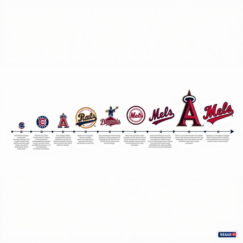
 Evolution of Major League Baseball Logos
The Power of Visual Identity in Baseball
A well-designed baseball league logo serves as a powerful branding tool, instantly connecting with fans on an emotional level. It becomes synonymous with the team’s values, playing style, and overall identity. Think of the fierce determination embodied in the Detroit Tigers’ roaring tiger head or the timeless elegance of the Chicago Cubs’ iconic “C.” These logos transcend geographical boundaries, becoming recognizable symbols across the globe.
Beyond aesthetics, baseball league logos play a crucial role in marketing and merchandise. From caps and jerseys to phone cases and coffee mugs, these emblems adorn a wide range of products, generating significant revenue for teams and leagues. The commercial success of a logo further solidifies its place in popular culture, transforming it into a coveted symbol of fandom and affiliation.
Deconstructing the Elements of a Baseball League Logo
While each baseball league logo is unique, most share common elements that contribute to their effectiveness. These elements work in harmony to create a visually appealing and memorable symbol:
- Typography: The font choice for a team’s name or initials plays a crucial role in conveying its personality. Bold, sans-serif fonts often project strength and confidence, while script fonts evoke a sense of tradition and history.
- Color Palette: The colors used in a logo are carefully chosen to represent the team’s geographic location, mascot, or historical significance. For example, the Boston Red Sox’s navy blue and red color scheme is a nod to the city’s maritime heritage.
- Imagery: Many baseball league logos incorporate imagery related to the team’s name, mascot, or city. This can range from abstract representations to detailed illustrations, adding another layer of meaning and visual interest to the design.
- Shape and Composition: The overall shape and composition of a logo are essential for readability and impact. Circular logos often convey a sense of unity and tradition, while angular shapes can suggest modernity and progress.
The Evolution of Baseball League Logos: From Classic to Contemporary
Over the years, baseball league logos have undergone significant transformations, mirroring shifts in design trends and cultural influences.
- Early Logos (Late 19th – Early 20th Century): Early baseball logos were often simple and typographic, focusing on team initials or city names. The emphasis was on clarity and readability, reflecting the limited printing capabilities of the time.
- Mid-Century Modernism (1940s – 1960s): The mid-20th century saw the rise of modernism in graphic design, which influenced baseball league logos. Logos became more stylized and abstract, incorporating geometric shapes, bold colors, and simplified imagery.
- The Brand-Conscious Era (1970s – 1990s): As baseball became increasingly commercialized, teams began to focus on developing strong brand identities. Logos became more elaborate, often featuring detailed illustrations, mascots, and wordmarks.
- The Digital Age (2000s – Present): The rise of the internet and digital media has led to a trend towards simpler, more versatile logos. Many teams have opted for minimalist designs that are easily recognizable on small screens and across various platforms.
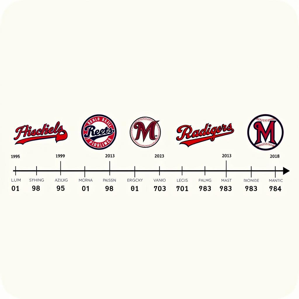
 A Historical Timeline of Baseball Logo Styles
Baseball League Logos: A Legacy of Design and Storytelling
Baseball league logos are more than just visual identifiers; they are powerful symbols that encapsulate the history, spirit, and enduring appeal of America’s pastime. From their humble beginnings as simple typographic emblems to their evolution into sophisticated brand marks, these logos have played a pivotal role in shaping the visual identity of baseball and connecting fans across generations. As the game continues to evolve, so too will its logos, reflecting new design trends while honoring the rich legacy of this beloved sport.

